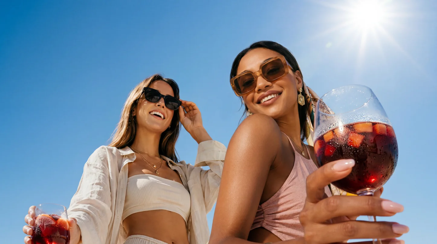
Reál Sangria
Packaging, a website and social for a zero-sugar version of a classic sangria.
- Role
- Art Director
- Team
- Small Circle
- Services
- Packaging design
- Web design
- Campaign & Strategy
- Year
- 2026
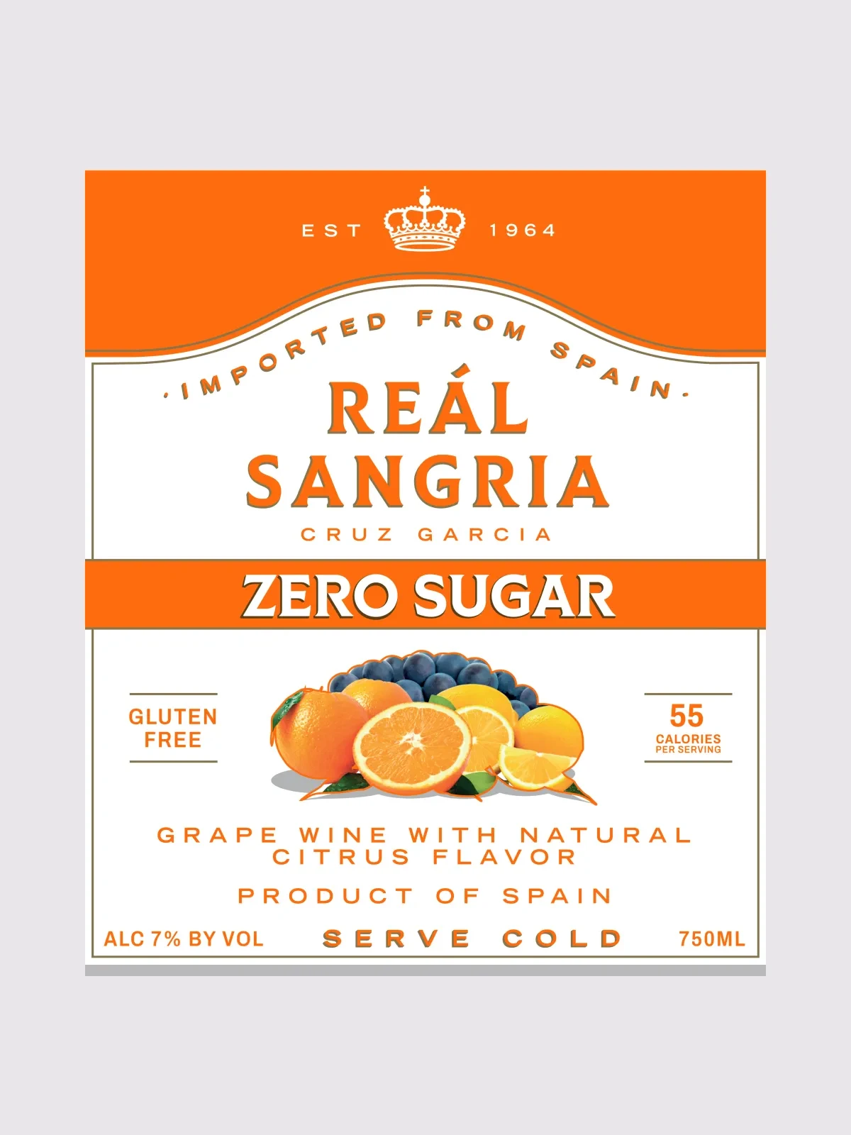
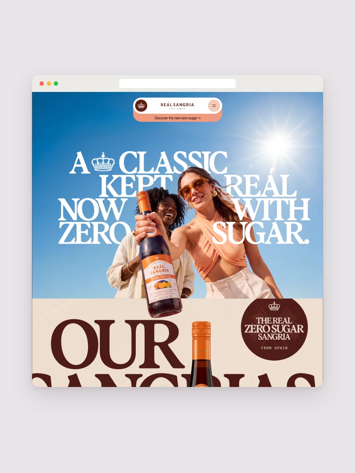
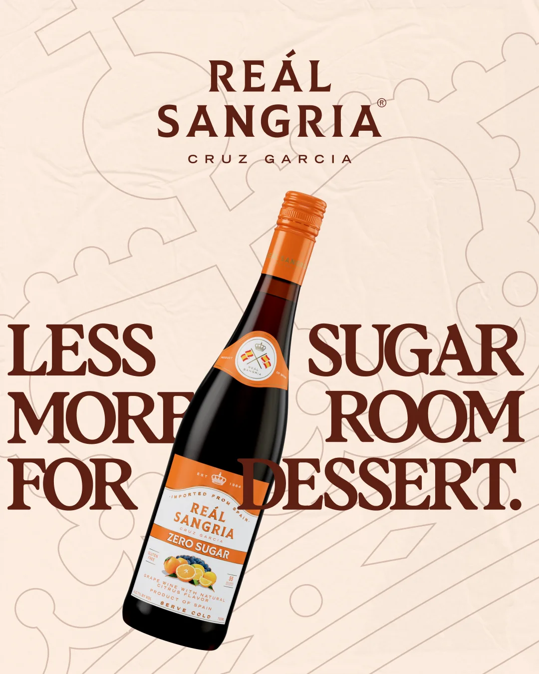
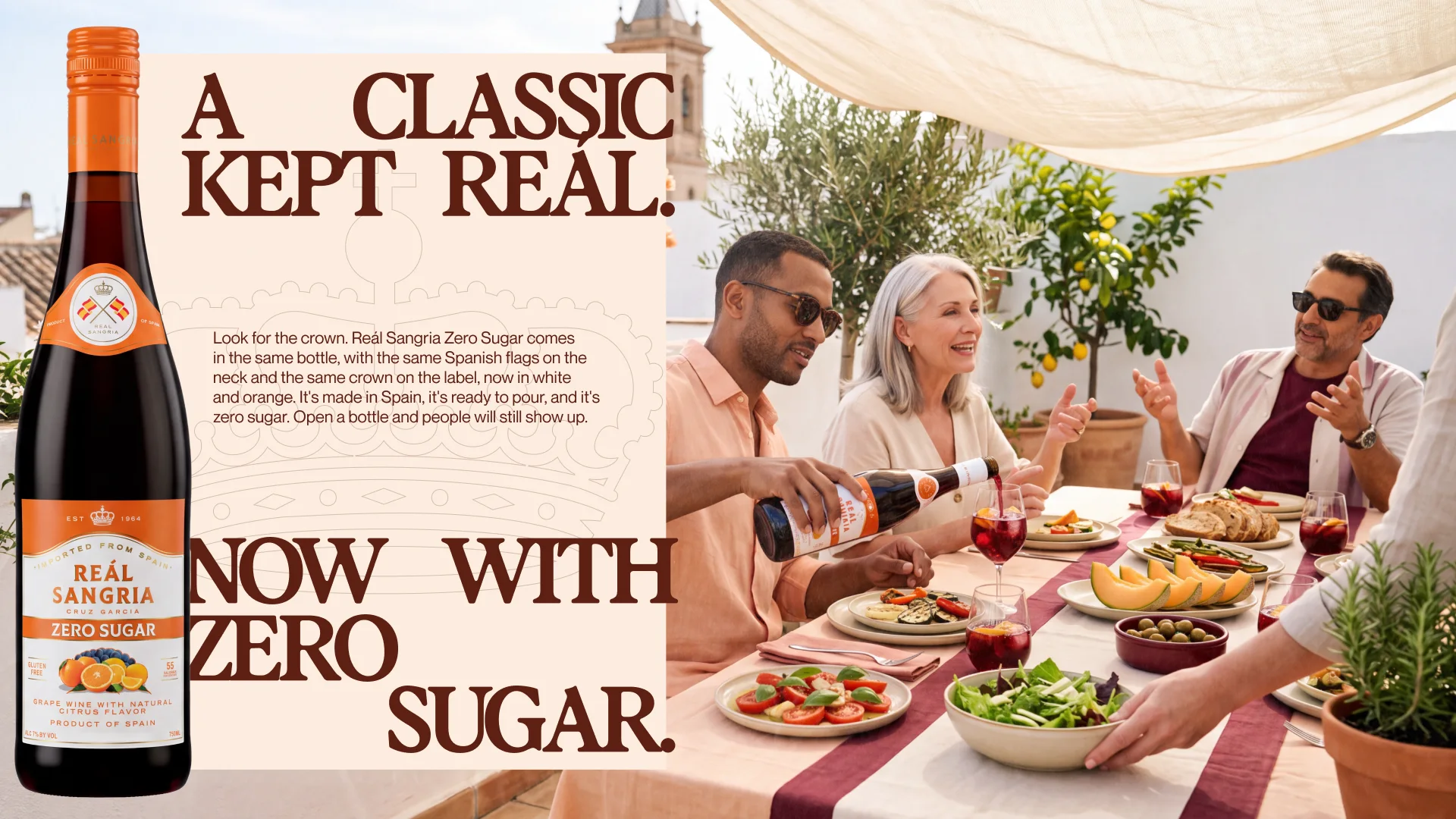
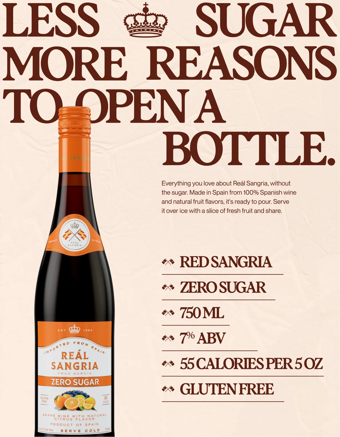
Reál Sangria launched a zero-sugar version of its classic sangria. We designed the new label system and built the website, the social assets and the retail pieces that carried the launch.
Label
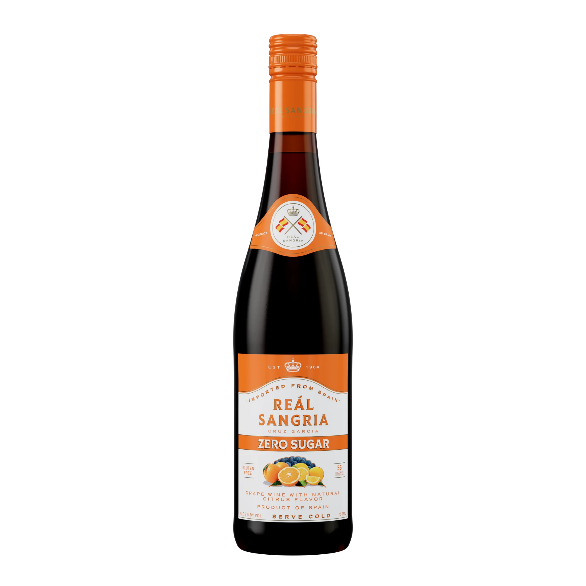
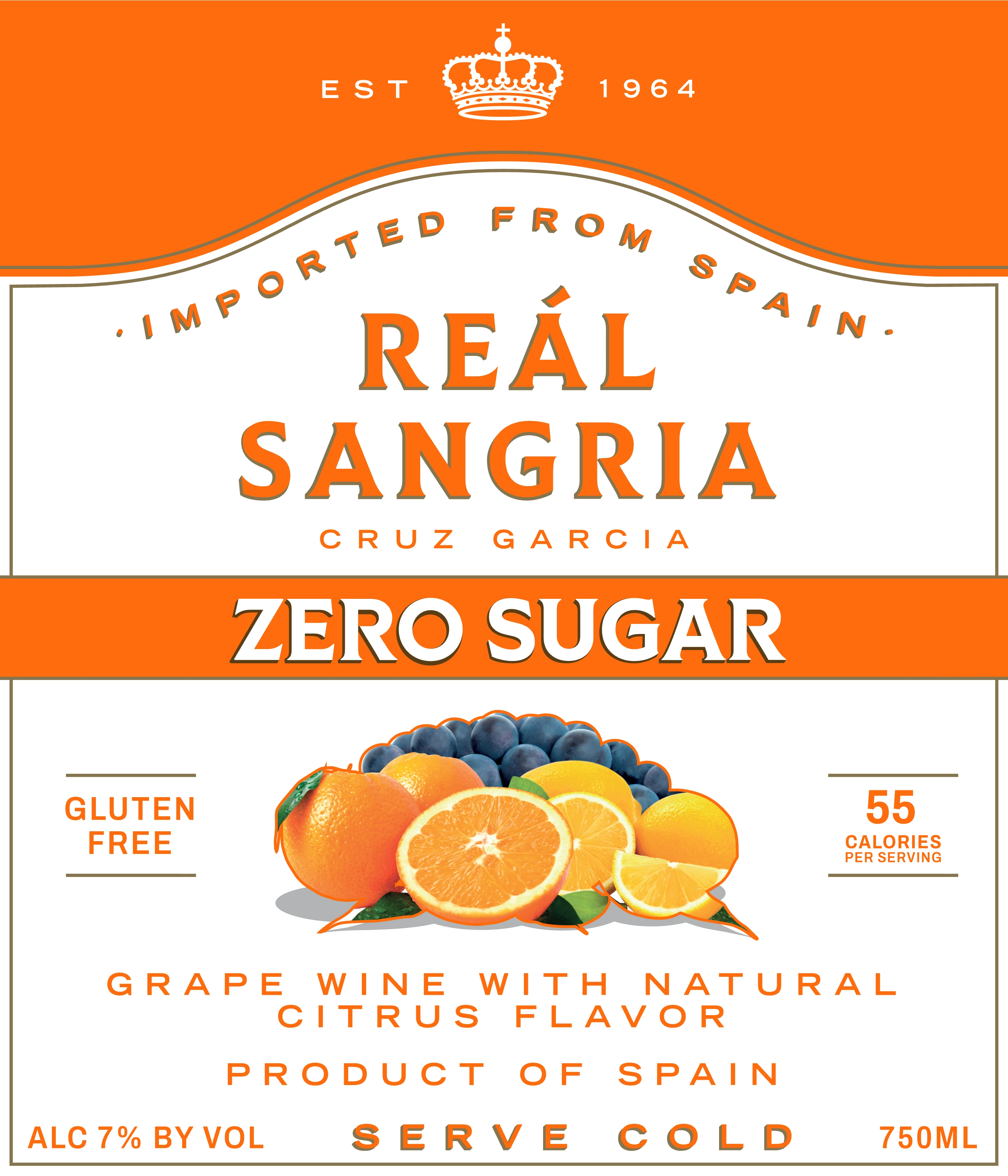
Zero sugar couldn't look like a diet drink. We designed the label as a system that can grow as the product line expands.
Website
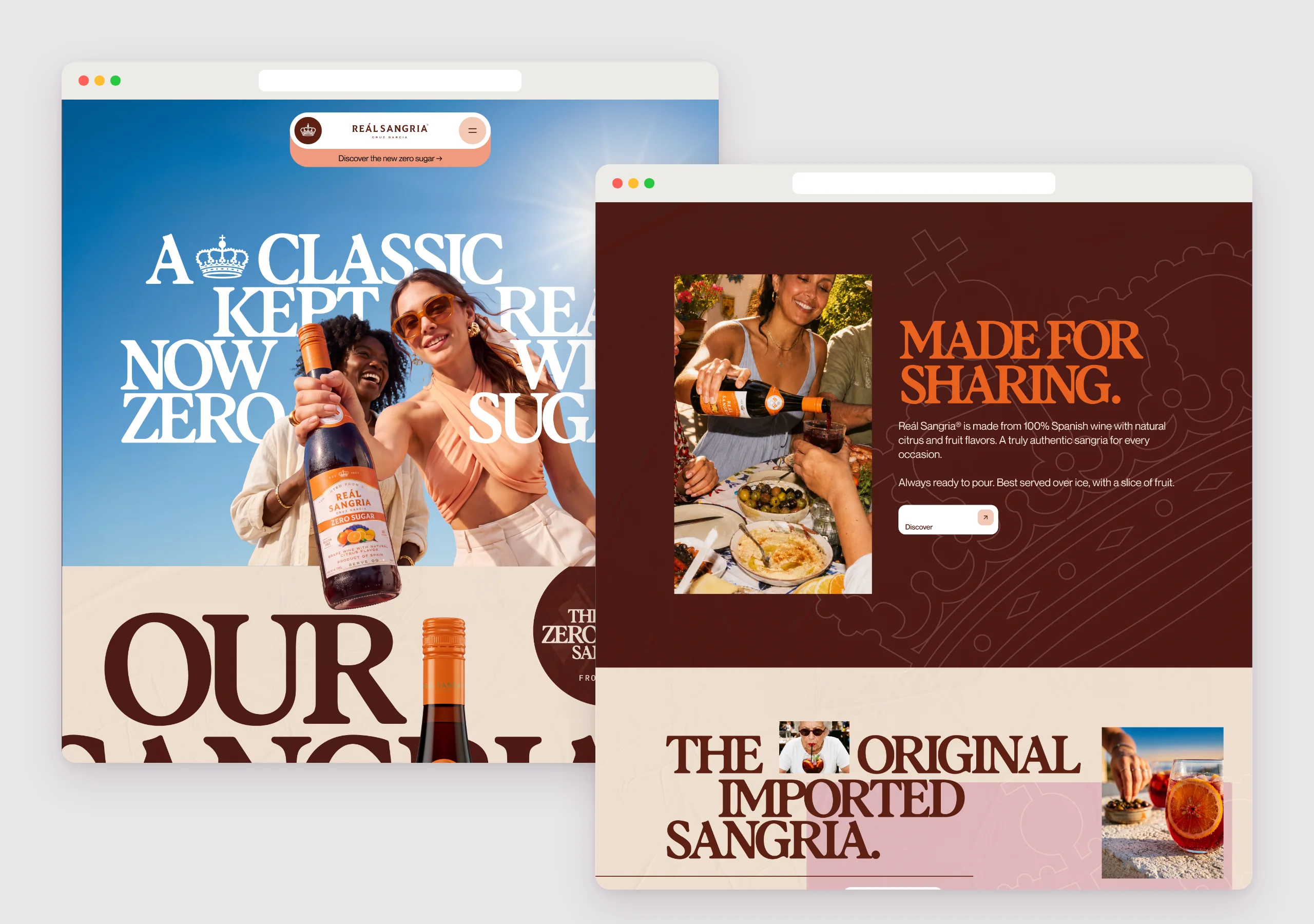
The site leans into a Spanish summer, with big type, the brand's terracotta and wine reds, and photography of the drink being shared.
Retail
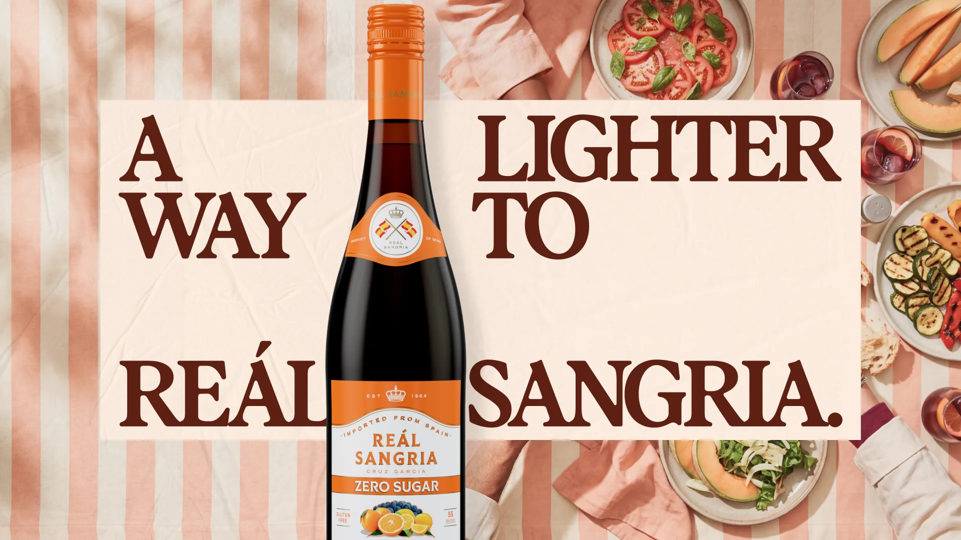
The campaign carried into retail assets for in store and for distributors, built from the same type and colour as social and the site.
Process
- Figma
- Illustrator
- Photoshop
- AI
Credits
- Design
- Darren Browne
- Agency
- Small Circle
Back to the grid
For those who want something worth finding.
Social
We adapted the Reál Sangria voice for the zero-sugar line so it feels lighter without losing the brand. We also built a colour system that tells the bottles apart at a glance, giving Zero Sugar a lighter cream to match what it offers.